ABOUT:
For this assignment I decided to design both a CD and website for a new musical theatre production called “Rumspringa Break!”. The play is co-written by my brother and some friends. The story is about two Amish twins Hannah and Ruth, who leave the comfort of their strict, sheltered community to explore the outside world for the first time, and things don’t go as planned. Desperate, penniless, and stranded in the big city’s roughest neighbourhood, the naïve sisters must rely on their faith, the outlandish locals, and each other to survive.
CD DESIGN CONCEPT:

Rumspringa Break! CD Design
The play is full of contrast and I wanted that displayed in the design of the CD. Even the type used in the title of the play uses this contrast. The old English typeface in contrast with the grunge brush lettering. For the design of the CD package I used a desaturated muted grungy image of the twins heading to the city and the derelict home they called home. This is in stark contrast to when you open the CD and have the brightly coloured landscape of the idyllic farm life with open fields and rolling landscapes.
Being that this is a Musical that is currently being workshopped and developed, I wanted to focus more on the creative team than a specific production. Additionally, I decided to go with a more cost-effective approach to the packaging by using a six panelled eco-wallet.
Apple Music MockUP
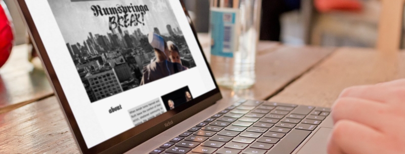
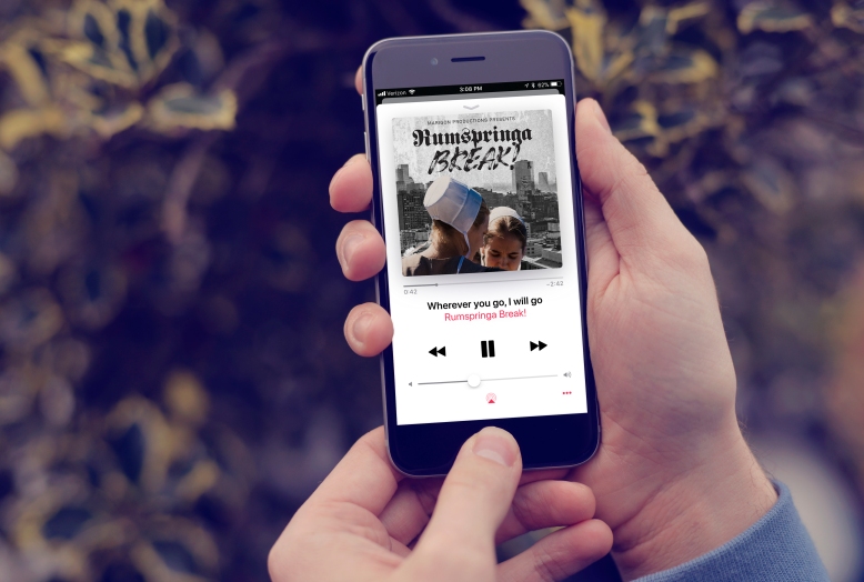
WEBSITE DESIGN:

Rumspringa Break! Website Mockup
As mentioned above, this play is still under development so I wanted the focus of the website not to be on a specific production. Thankfully, Rumspringa Break! has been performed on a few occasions, most recently as part of the Toronto Fringe: Next Stage Theatre Festival. This meant that I was able to get some great photos, a video as well as some audio tracks.
I decided that I wanted a one-page scroller so that all the information was easily viewed. Before any I started with any html, I wireframed the basic website layout to make sure all the elements flowed properly. Once I did that, it made it easier to create a full website mock-up in InDesign. For this I used a basic 960-pixel grid to keep all my elements properly aligned. I decided to include a small section about the musical, a section with a video and an audio clip from the musical, images from the most recent production in a lightbox and lastly a section highlighting the creative team involved in creating the Musical.


Once it was all laid out the way I wanted it, that is when I started coding the website. This was the first functional website that I designed and coded from scratch and while it wasn’t easy, I found it very useful and rewarding. When something didn’t work or look the way I wanted it, I enjoyed the challenge of trying to figure out how to resolve the issue. To make the website responsive, I had to make sure that the column system was in percentages that switch to a single column with a media-queries. I also used a slicknav menu (hamburger menu) for mobile users.

Final Rumspringa Break! Website

Rumspringa Break! Mobile Website
I found this composite a lot of fun and very challenging at the same time. Carrying many of the design elements in both print and web really kept all the elements cohesive.